


Color is a language, and like any language, it has its own vocabulary and grammar. In the world of fashion, understanding the psychology behind colors is akin to being fluent in this language. It allows you to convey specific emotions and messages through your outfits. From the powerful statement of red to the calming effect of blue, each color has a unique impact on our emotions and perceptions. In this comprehensive guide, we'll delve deep into the realm of color psychology in fashion, exploring how you can use it to curate outfits that not only look good but also evoke specific feelings.

Color theory is a fundamental concept in the world of art and design. It explores how colors interact with each other and how they can be combined to create harmonious or contrasting effects. Understanding color theory can be a powerful tool in various creative fields, from painting and graphic design to fashion and interior decorating.
At its core, color theory revolves around three primary properties of colors: hue, saturation, and brightness.
Hue:
This refers to the pure, basic colors on the color wheel, like red, blue, or yellow. It's essentially the "name" of a color.
Saturation:
Also known as chroma or intensity, saturation describes the vividness or purity of a color. A highly saturated color is vivid and intense, while a desaturated color appears more muted or grayish.
Brightness:
This property determines how light or dark a color is. It's often referred to as value. A color's brightness can be altered by adding white (to make it lighter) or black (to make it darker).

The color wheel is a fundamental tool used in art, design, and fashion to understand how colors relate to each other. It consists of a circular diagram of colors arranged by their chromatic relationship. Here are the key components of the color wheel:
Primary Colors:
These are the three basic colors from which all other colors are derived. They are red, blue, and yellow.
Secondary Colors:
These are created by mixing equal parts of two primary colors. They are green (from blue and yellow), orange (from red and yellow), and purple (from blue and red).
Tertiary Colors:
These are formed by mixing a primary color with a neighboring secondary color. They include colors like red-orange, yellow-green, etc.
Complementary Colors:
These are located directly opposite each other on the color wheel. When paired together, they create a high-contrast, vibrant look.
Analogous Colors:
These are located next to each other on the color wheel. They create a harmonious, pleasing effect when used together.
Monochromatic Colors:
This scheme uses variations in the lightness and saturation of a single color. It creates a harmonious and unified look.
Warm Colors:
These are colors that are associated with warmth, like reds, oranges, and yellows. They tend to be stimulating and energetic.
Cool Colors:
These are colors associated with coolness, like blues, greens, and purples. They tend to be calming and soothing.
Neutral Colors:
These are achromatic colors like black, white, and gray. They provide a stabilizing and balancing effect in color schemes.
Understanding the color wheel helps in creating visually appealing and balanced color palettes in various creative fields, including fashion. It's a valuable tool for artists, designers, and stylists looking to make intentional color choices.

Color harmony refers to the pleasing arrangement of colors in a way that is visually appealing and balanced. It involves the combination of different colors to create a sense of order and coherence in a design or composition. Here are some common types of color harmony:
Analogous Harmony:
This involves using colors that are adjacent to each other on the color wheel. For example, combining red, red-orange, and orange creates an analogous color scheme. This creates a harmonious and soothing effect.
Complementary Harmony:
This involves using colors that are opposite each other on the color wheel. For example, red and green are complementary colors. When used together, they create a high-contrast, vibrant look.
Monochromatic Harmony:
This scheme uses variations in the lightness and saturation of a single color. For example, using different shades of blue creates a monochromatic color scheme. This creates a harmonious and unified look.
Neutral Harmony:
This involves using neutral colors like black, white, and gray as the dominant colors in a design. Neutrals can be paired with a pop of color for contrast or used to create a subtle and sophisticated look.
Achromatic Harmony:
This uses only black, white, and grays, with no hues. It creates a clean, minimalist look and is often used in modern and contemporary design.
Understanding color harmony is crucial for creating visually appealing designs in various fields, including fashion, interior design, and graphic design. It helps in making intentional color choices that convey the desired mood, style, and message.

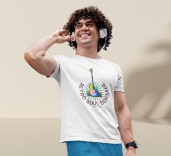
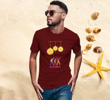
Elevate Your Wardrobe with Emotional Impact" suggests a transformative approach to fashion, implying that your clothing choices can have a profound effect on how you feel and how others perceive you. This title implies a deeper connection between personal style and emotions, encouraging the reader to consider their clothing not just as garments, but as a means of self-expression and empowerment. It's an intriguing invitation to explore the emotional dimension of fashion.
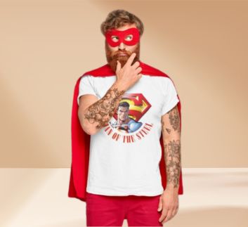
At Mon Zurich, we believe that clothing is a canvas for emotions. Take our vibrant red tees, for instance. They exude confidence and passion, making them perfect for moments when you want to make a bold statement. On the other hand, our soothing blue shades evoke calmness and trust, ideal for moments of serenity. Each color and print is carefully curated to not only elevate your style but also resonate with your emotions, ensuring you step out with confidence and purpose."
This example showcases how Mon Zurich carefully selects colors and prints to evoke specific emotions, aligning with the idea of "Elevate Your Wardrobe with Emotional Impact".

Color in fashion styling is a potent tool for expressing personality, creating moods, and making powerful statements. It's not just about choosing hues that look good together; it's about understanding the psychological impact of colors and their ability to influence perception. Let's explore some key aspects of color in fashion styling:
Psychology of Colors:
Each color evokes specific emotions and associations. For instance, red signifies passion and energy, while blue exudes calm and trust. Understanding these psychological triggers helps in conveying the desired message through clothing.
Color Harmony:
Achieving balance and visual appeal in an outfit involves understanding color harmony. This includes complementary colors (opposite on the color wheel), analogous colors (side by side on the wheel), and triadic colors (evenly spaced).
Monochromatic Magic:
A monochromatic look involves different shades and tones of a single color. This creates a clean, sophisticated appearance and is a go-to choice for a polished, put-together outfit.
Contrasting Elements:
Combining colors with high contrast can create a bold, attention-grabbing look. For example, pairing a bright red top with black bottoms creates a striking visual impact.
Neutral Grounding:
Neutrals like black, white, beige, and gray act as versatile base colors that can be paired with almost any other color. They provide a canvas for other colors to shine or can be used to create a chic, minimalist look.
Seasonal Palettes:
Fashion often draws inspiration from the seasons. Spring colors are light and fresh, while fall colors tend to be warm and earthy. Adapting your wardrobe to seasonal palettes can keep your style current and in harmony with nature.
Statement Colors:
Using a single bold color amidst neutrals or softer shades can create a striking focal point. This can be achieved through a statement accessory, a pop of color in a shoe, or a vibrant jacket.
Cultural Significance:
Colors hold cultural significance in various societies. For instance, white is associated with purity in Western cultures, while it symbolizes mourning in some Eastern cultures. Being mindful of these associations is crucial in a globalized fashion landscape.
Prints and Patterns:
The combination of colors in prints and patterns can make or break an outfit. Understanding color balance within a print is key to ensuring it complements the rest of the ensemble.
Personal Palette:
Knowing your color palette based on your skin tone, hair color, and eye color is invaluable. It helps in choosing colors that enhance your natural features and make you look radiant.
In essence, color in fashion styling is a dynamic interplay of creativity, psychology, and personal expression. By mastering the art of color coordination, you can unlock endless possibilities in curating outfits that not only look visually appealing but also resonate with your unique style and personality.

Working with color in fashion is an art that requires both an understanding of color theory and a keen eye for aesthetics. Here are some practical tips to help you master the art of working with color in your outfits:
Start with the Basics:
Familiarize yourself with the color wheel and the relationships between different colors. Understand concepts like complementary, analogous, and triadic color schemes.
Consider Your Undertone:
Determine whether you have warm or cool undertones in your skin. This will guide you in choosing colors that complement your complexion.
Build a Neutral Foundation:
Invest in high-quality neutral pieces like black, white, beige, and gray. These form the backbone of a versatile wardrobe and serve as a canvas for adding pops of color.
Experiment with Monochromatic Looks:
A monochromatic outfit uses different shades and tones of a single color. It's an easy way to create a polished and sophisticated look.
Balance Bold with Neutral:
If you're wearing a statement color or a bold print, balance it with neutral pieces to avoid overwhelming the outfit.
Use Accessories Wisely:
Accessories like scarves, belts, shoes, and handbags are excellent tools for injecting color into your outfit. They can add a pop of vibrancy without committing to a full-color ensemble.
Understand the Power of Prints:
Pay attention to the color combinations in prints and patterns. They should harmonize with the rest of your outfit. For example, a floral print might have a dominant color that you can use as a reference point.
Consider the Occasion:
Different occasions call for different color palettes. Formal events often lean towards subdued and classic colors, while casual outings allow for more experimentation.
Mix Textures for Depth:
Combining different textures in similar shades can add depth and interest to an outfit. For instance, pairing a wool sweater with a silk scarf in similar tones can create a visually appealing contrast.
Trust Your Instincts:
Ultimately, personal style is about self-expression. If a color makes you feel confident and comfortable, it's likely a good choice for you.
Stay Updated with Seasonal Trends:
Fashion trends often dictate popular color palettes for a given season. Staying aware of these trends can help you incorporate fresh and current colors into your wardrobe.
Seek Inspiration:
Look to fashion magazines, blogs, and even art and nature for color inspiration. Seeing how others combine colors can spark your creativity.
Remember, there are no hard and fast rules in fashion. Experimentation is key, and sometimes the most unexpected color combinations can yield stunning results. Trust your instincts and have fun with color in your outfits

In the tapestry of fashion, color isn't just a visual element; it's a language of emotions. It has the power to invigorate, calm, empower, and inspire. By understanding and harnessing the emotional impact of color, you're not just dressing your body; you're adorning your soul. So, as you navigate your wardrobe, let each color choice be a deliberate brushstroke, painting a portrait of confidence, passion, and purpose. Elevate your style, and let your wardrobe resonate with the emotions that define you. Embrace the power of color and step out with a newfound sense of self-assuredness and flair.